Clink is a mocktail brand I created for my Directed Projects class. I created everything from the ground up, including the logo, color palette, typography, brand voice, brand standards book, packaging, business applications, and marketing materials. The brand comes together with a clear sense of energy and intention.

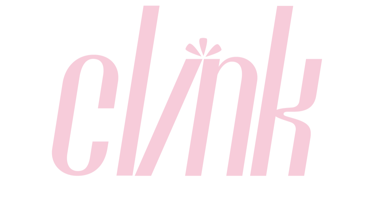
Logo
This logo was designed to capture the motion of two bottles clinking together. I tilted the letter “i” so it leans into the letter “n” and creates the feeling of contact. The brand name itself is an onomatopoeia, so the mark needed to suggest a sound or a moment of impact. This small shift in the letterforms helps the logo feel lively and gives a visual echo of the clink.
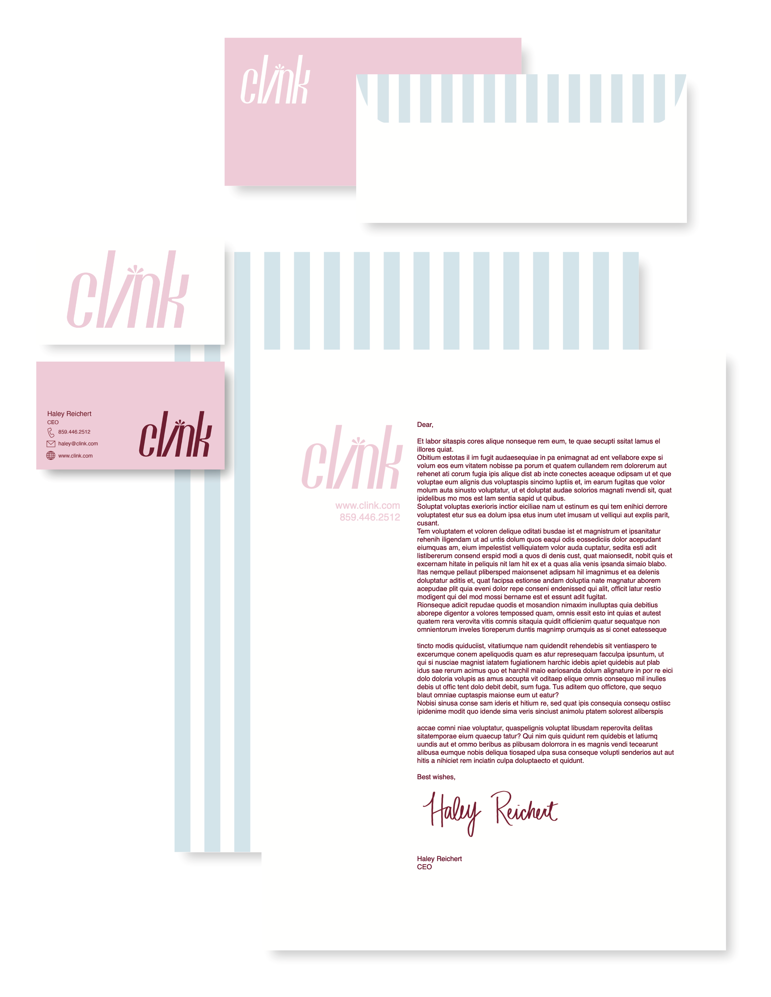
Business applications
These business applications include a business card, envelope, and letterhead that bring the Clink identity into everyday use. I used my own handwriting, a custom pinstripe pattern, and the signature pink to bring personality into a clean and cohesive system.
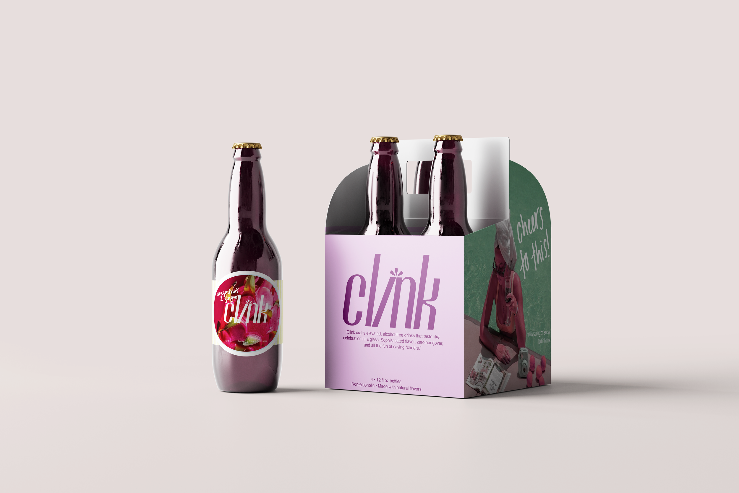
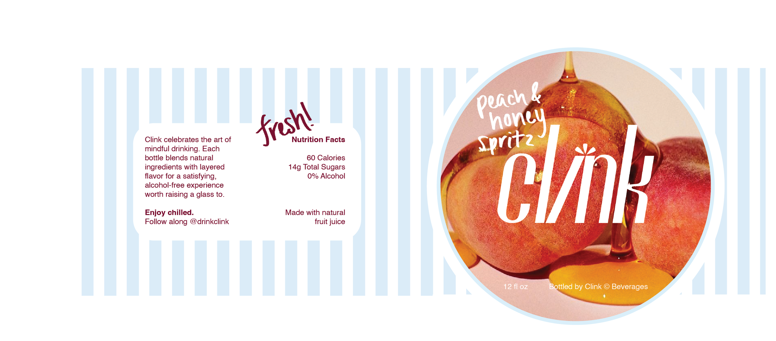

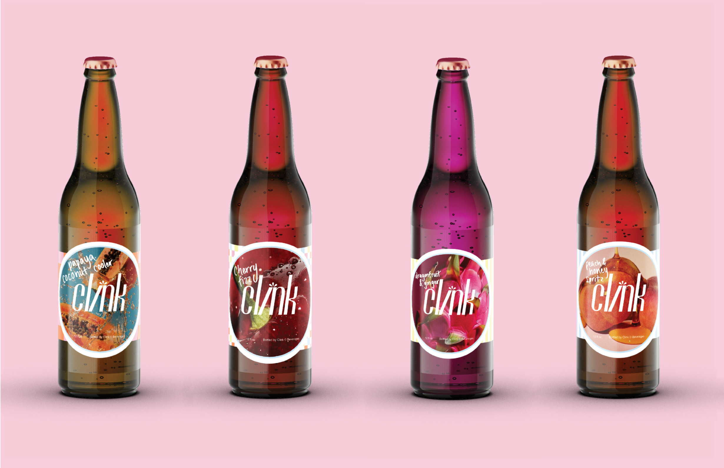
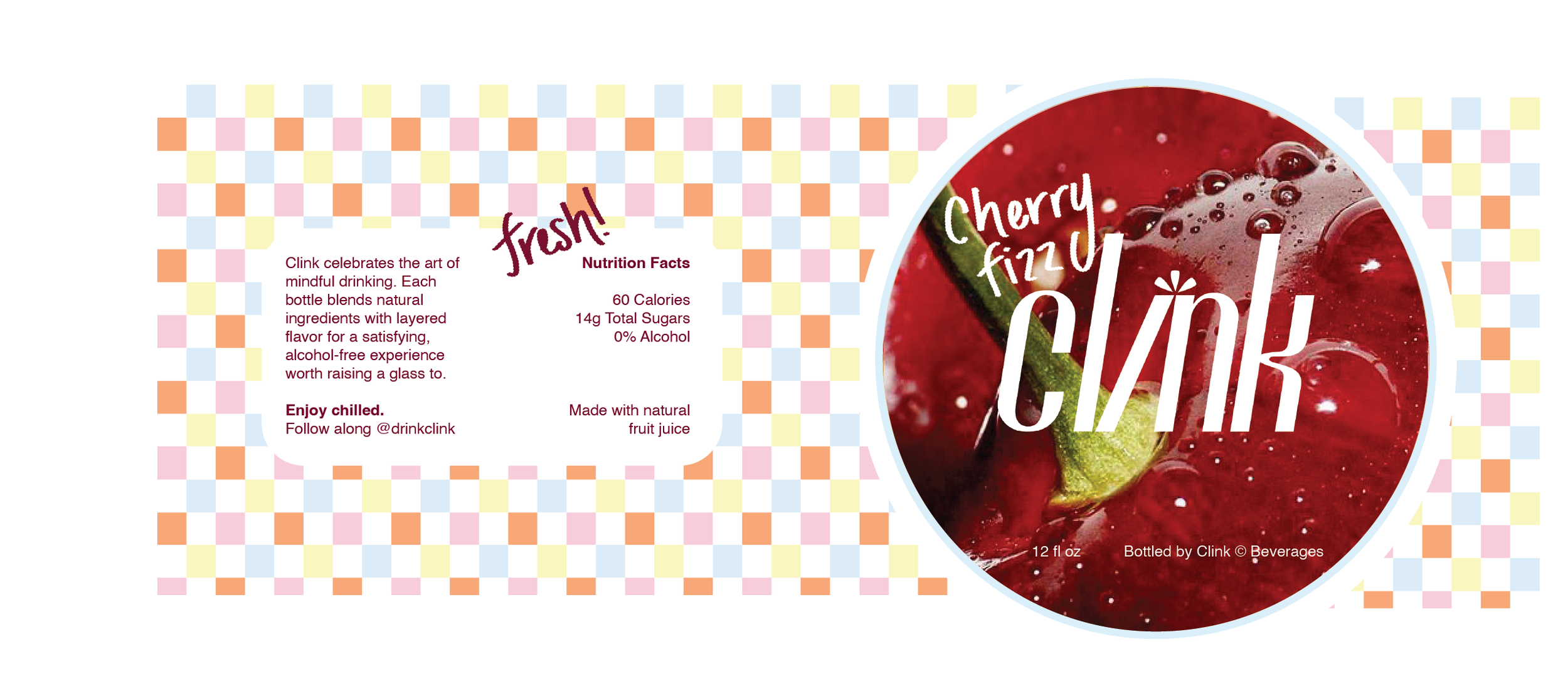
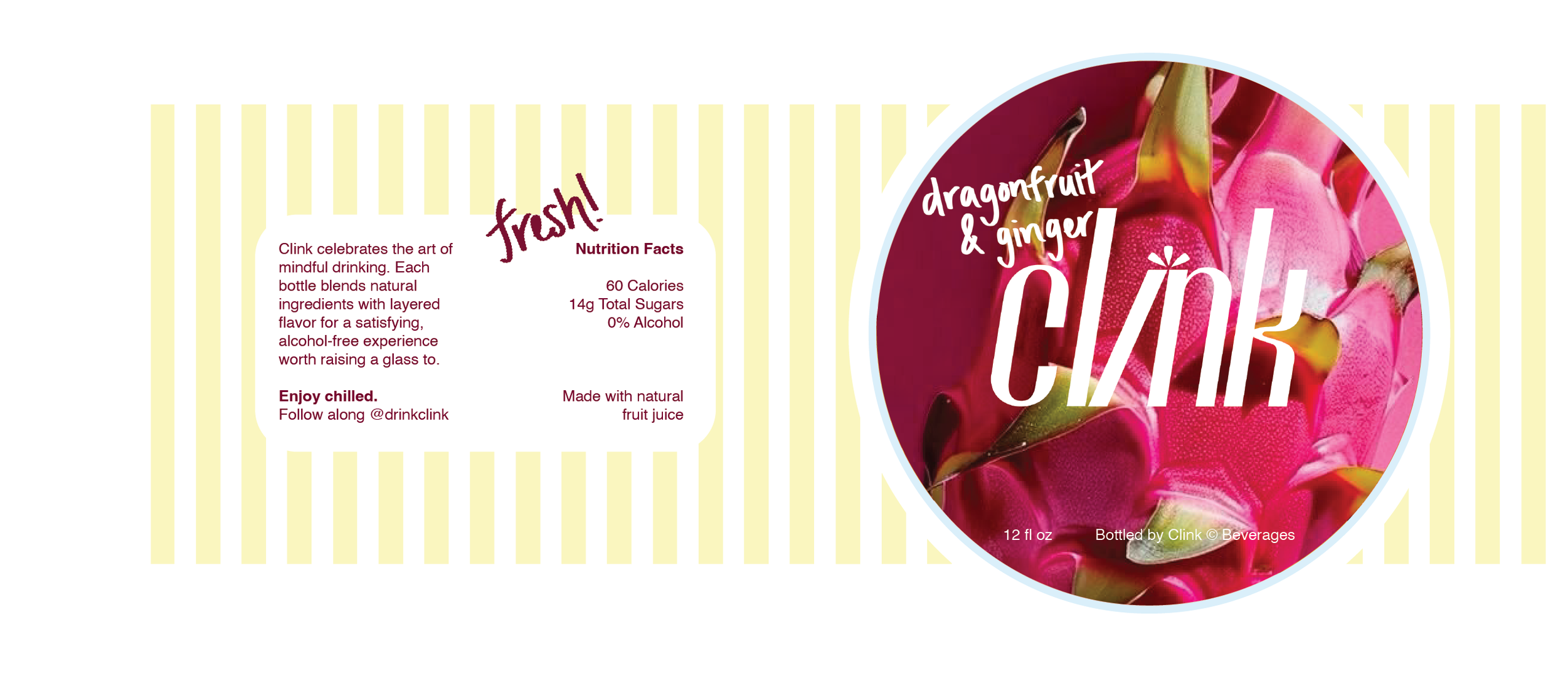
Packaging
The packaging brings every Clink element together in a way that feels elegant and confidently feminine. The bottle and four pack carrier layer in the brand’s patterns, logo, photography, typography, handwriting, color palette, and voice to create a cohesive system with real presence. Each detail supports a refined look that still feels intentional and full of personality.
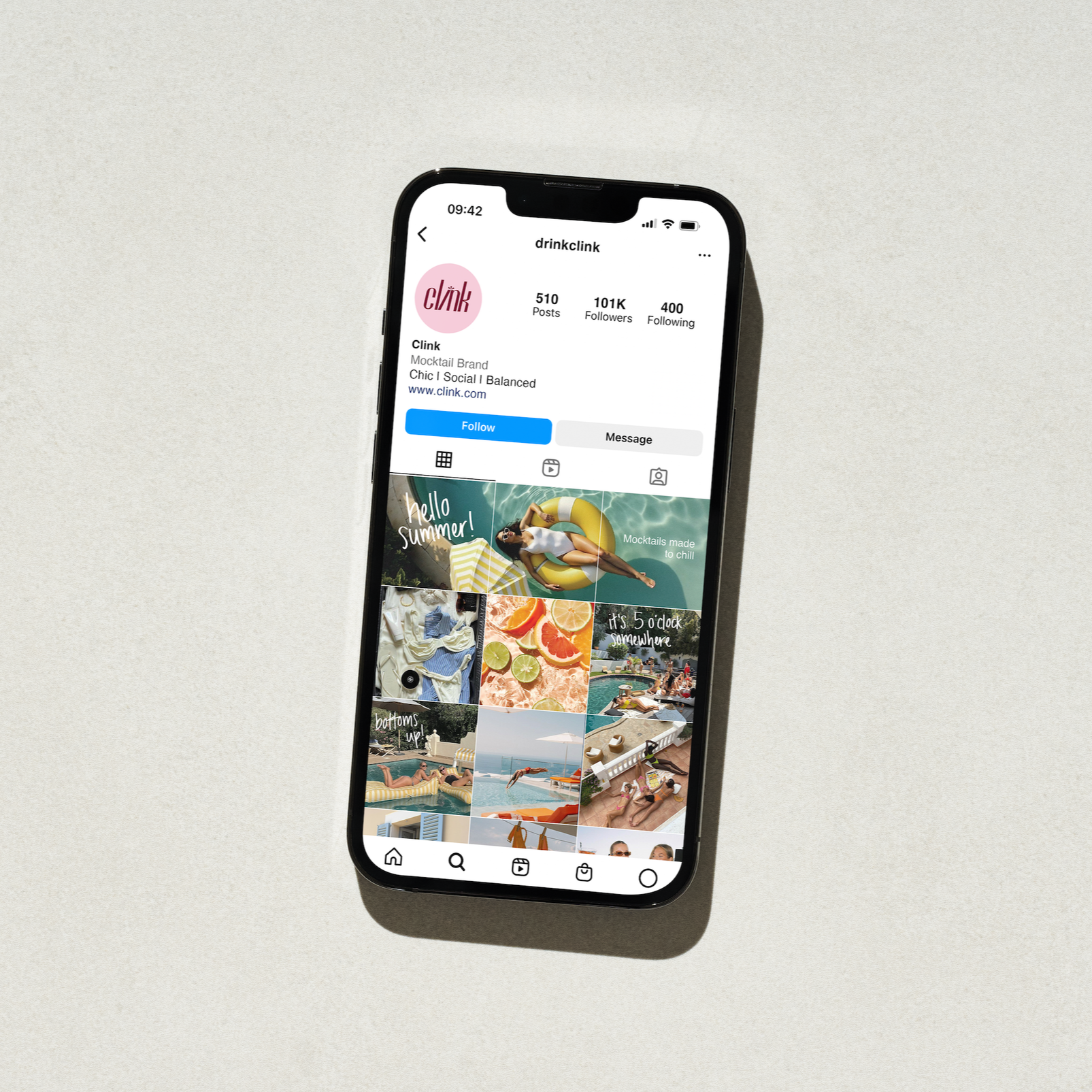
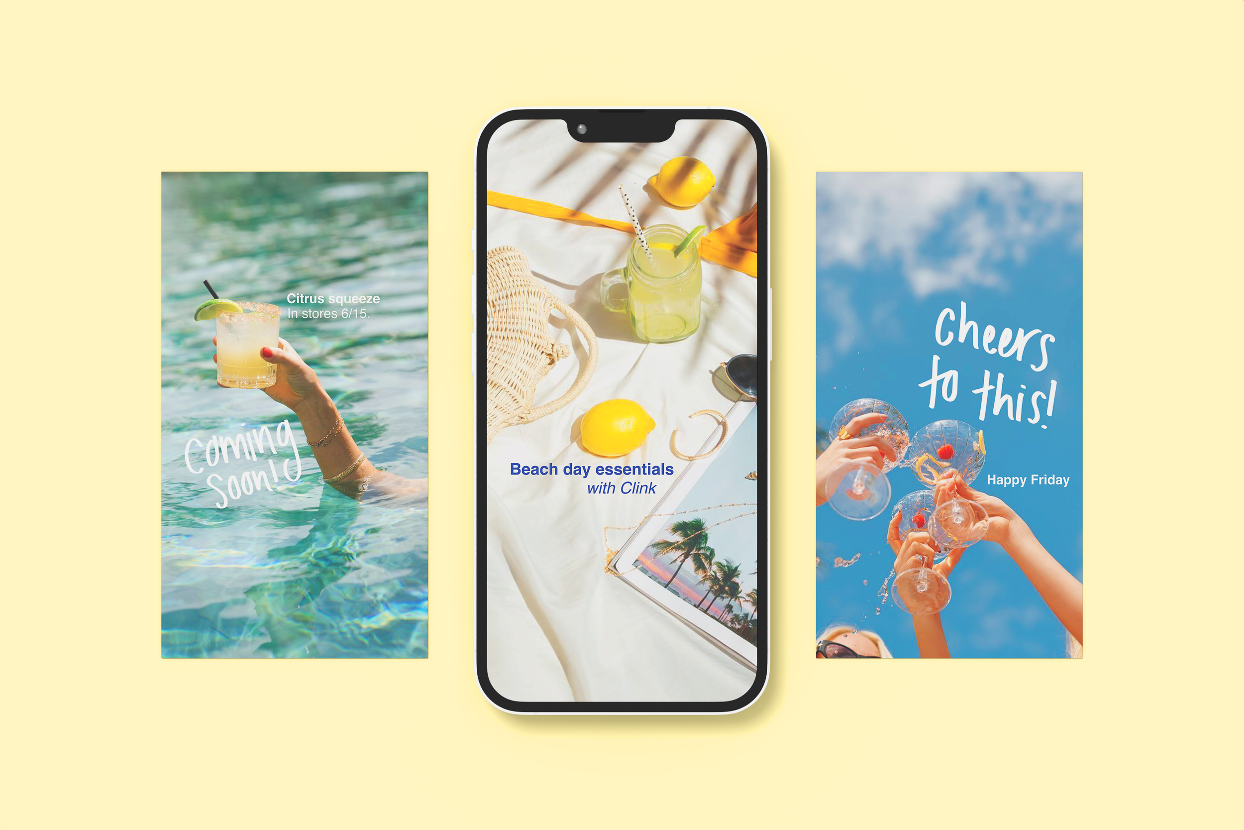
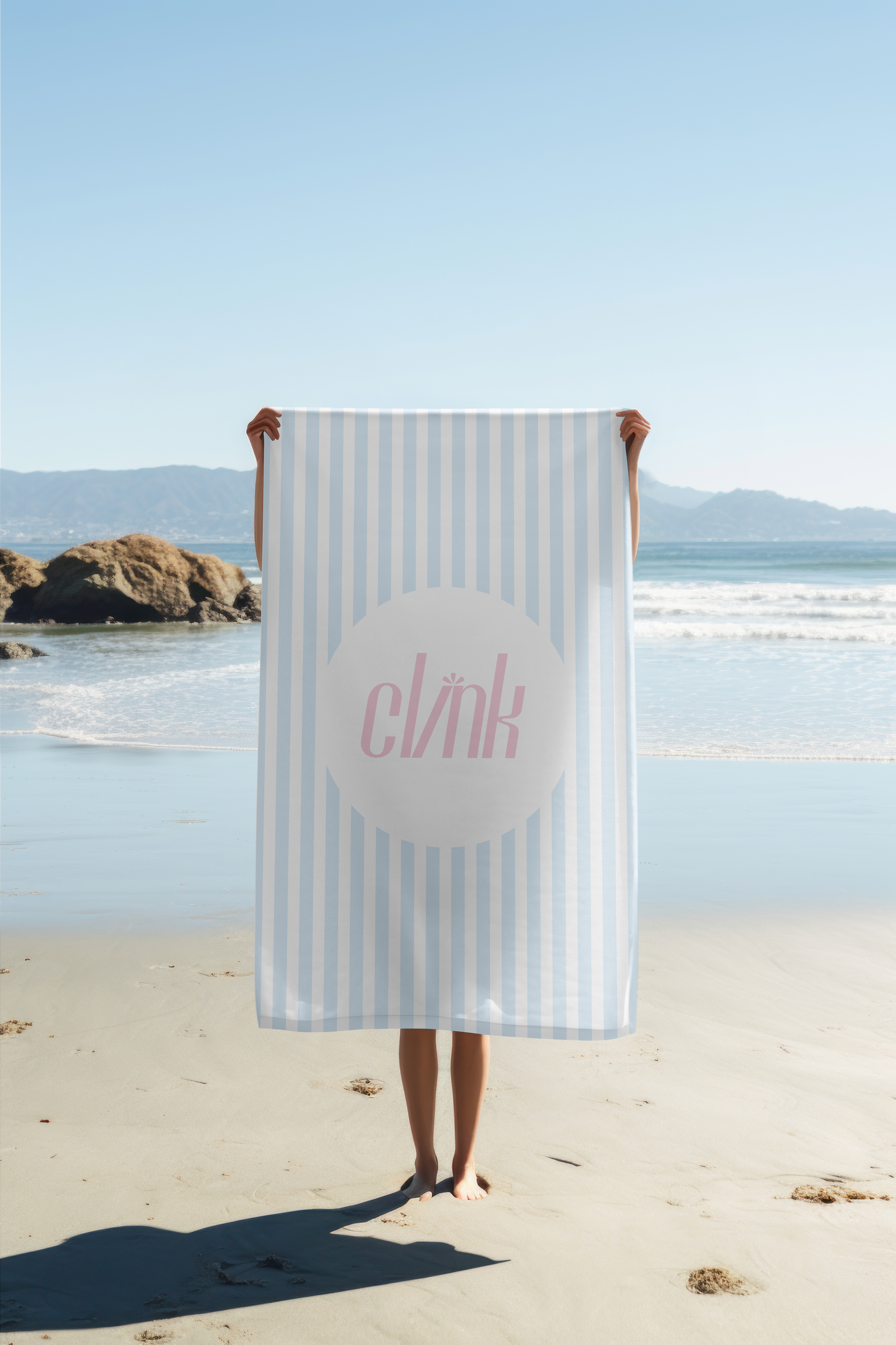
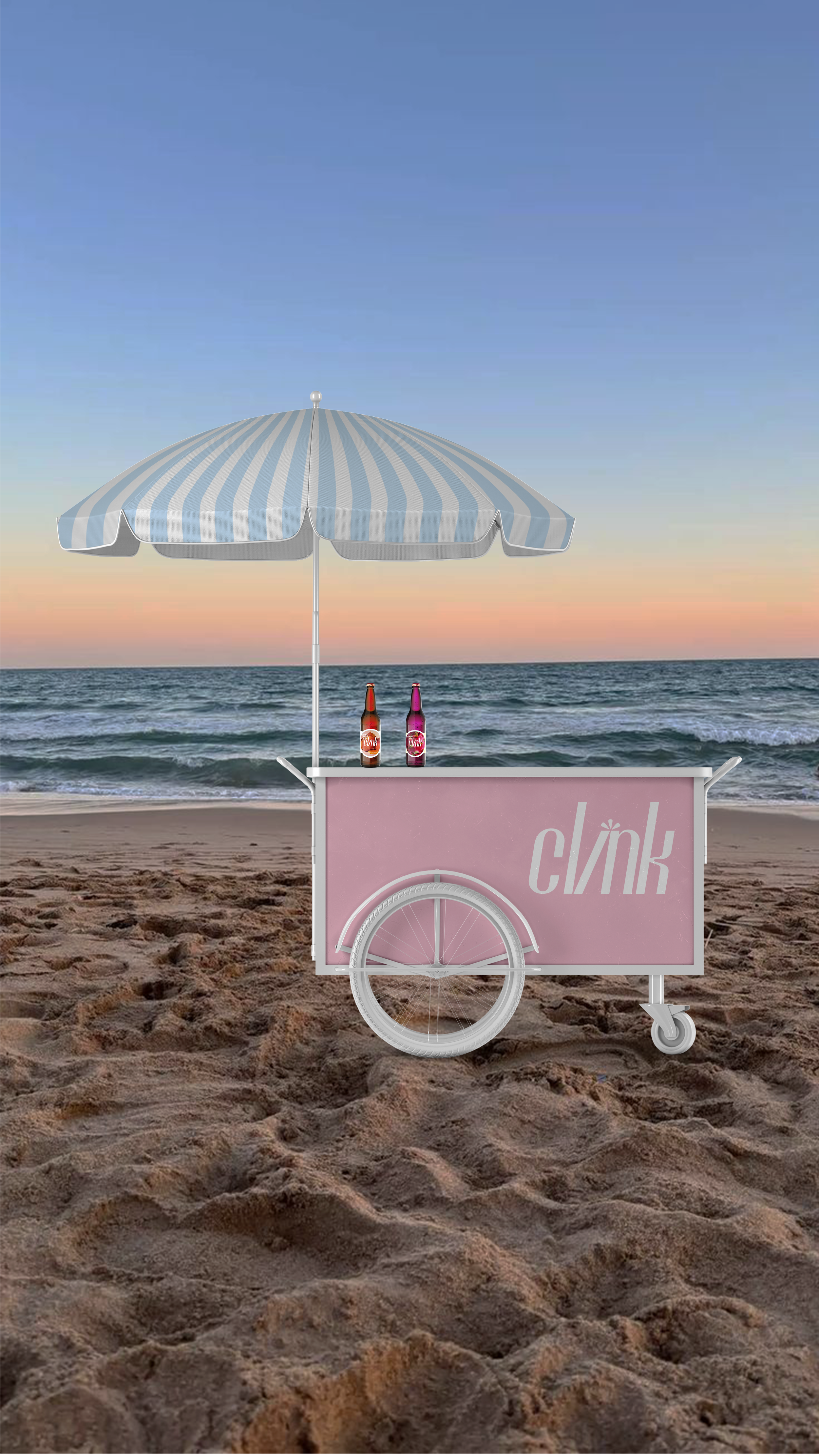
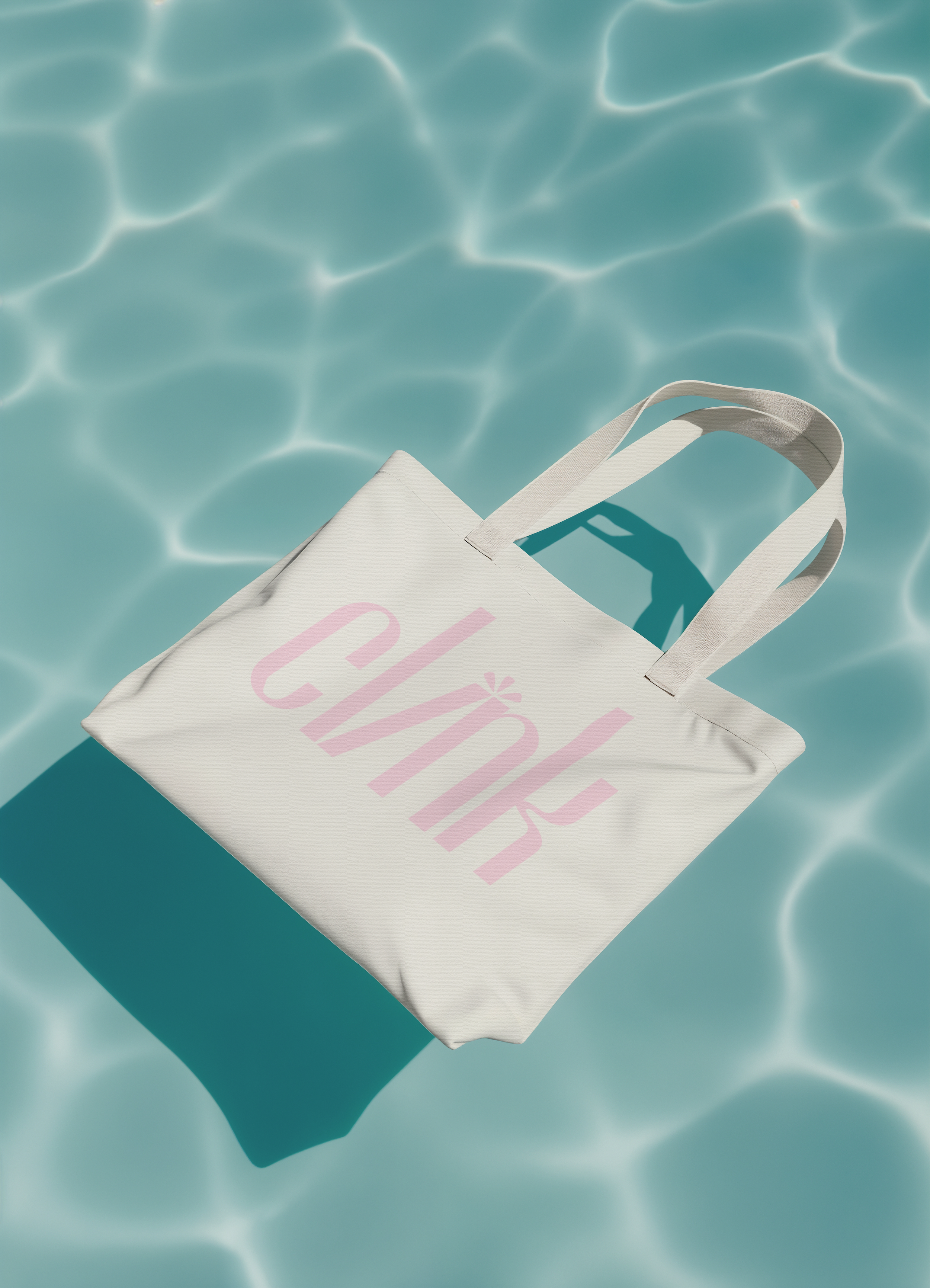
Marketing Materials
The marketing materials bring the brand into real touchpoints that feel fresh, cohesive, and easy to recognize. I used photography, a consistent color palette, and strategic typography to create a unified look across social media and merchandise. These choices connect the Instagram profile, feed, and stories with the beach towel and beach bag, so every element feels intentional and part of the same visual system.