

Proof is a skincare brand built on the idea that sun protection should be effortless. By incorporating SPF directly into the routine, it removes the need for an added final step. For my Packaging Design class, I created a family of three products, focusing on cohesive packaging, clear hierarchy, and a strong, unified brand identity.
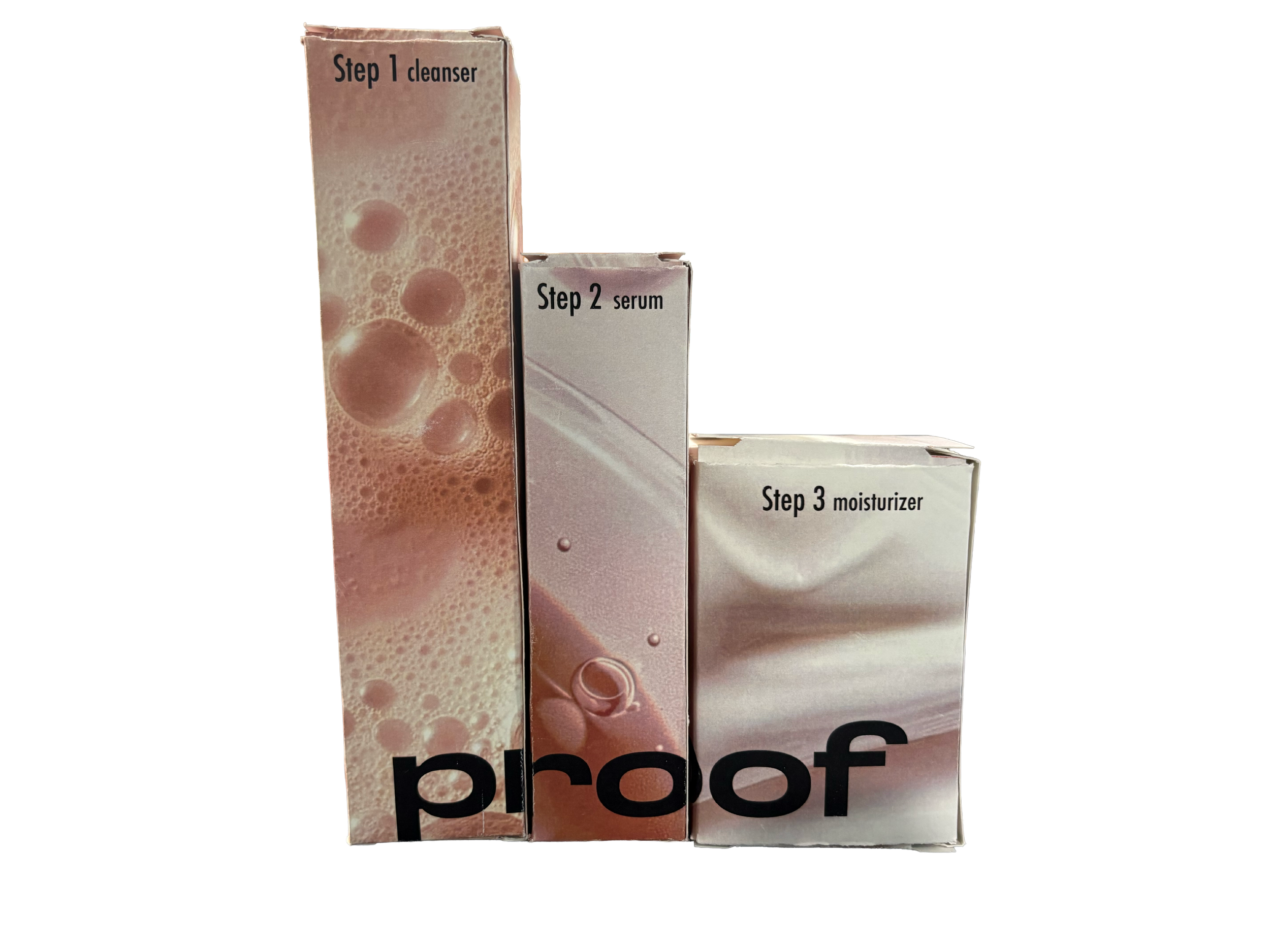
Box Packaging
Designed as a unified system, the boxes visually connect the three products into a cohesive family. The bold, distinctive approach pushes beyond typical safe skincare packaging to create stronger shelf presence and brand recognition.
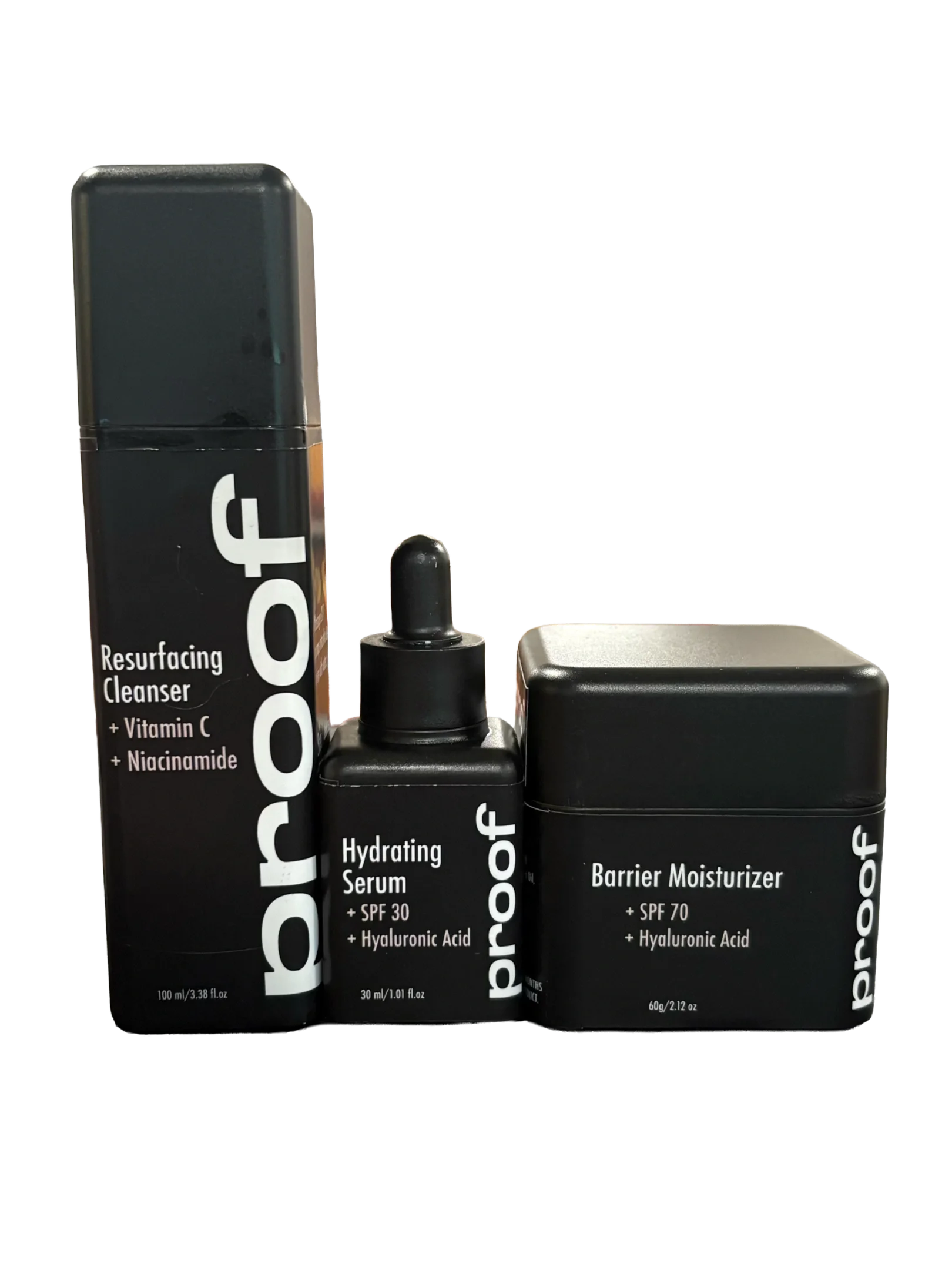
Bottle Packaging
The bottle labels contrast the bold packaging with an all-black base, creating a more grounded, functional feel. Clear typography and hierarchy ensure consumers can quickly understand the product and how to use it without confusion.